

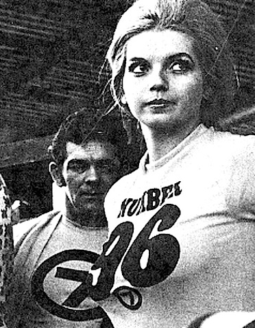
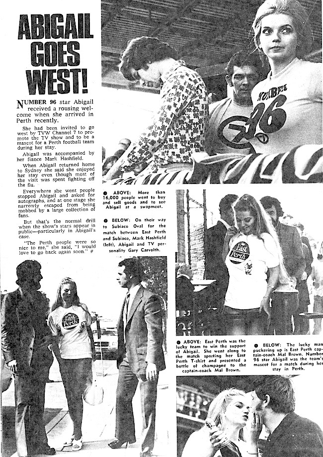
Andrew Bayley of TELEVISIONAU (http://www.televisionau.com) posed a question regarding a TV Week article from 1973 showing the Number 96 star Abigail, on a visit to Perth. Andrew was curious as the T-shirt she was wearing was emblazoned with the Circle 7 logo. A logo Andrew was familiar with in the eastern states, but not aware of its use that early in WA. Andrew then asked if TVW-7 ever used the Circle 7 logo, before the advent of colour TV? His understanding was that TVW adopted the network 7 Circle logo in the late 70s, as a colour version? The TV show Number 96 came from the TEN network, but as TVW had no fixed affiliation in those days, programs were sourced from a variety of networks, including the Nine network, with Brian Treasure having a long working relationship with Sir Frank Packer and later, Kerry Packer. Its assumed the T-shirts were created for TVW as TEN would not otherwise associate the program with a competing network.
The common use of logos over TV networks was largely dependant on ownership, as all commercial stations had independent origins, meaning that not all network decision making was synchronised in the early days. More so with TVW, as it enjoyed more than 5 year of being the only commercial station in Perth, until STW-9 was launched on 12th June 1965. Even then it had a loose affiliation with the other Seven stations, taking programs from both the Nine and Ten networks (such as Number 96).
Interestingly, TVW and STW formed a company called TV Facilities, in which they had equal shares. It was a ‘cartel’ formed for buying both Australian and overseas programs, so that they could keep the price down. TVW did not take up an affiliation with the other Seven stations until NEW-10 opened in Perth on 20th May 1988, and aligned itself with Network Ten.
The Seven Network started as separate companies, with origins dating back to 4th November 1956, when HSV Channel 7 Melbourne began broadcasting. It was licensed to The Herald and Weekly Times Ltd and was joined on 2nd December by the Fairfax subsidiary ATN Channel 7 Sydney, both established on the VHF7 frequency band.
TVW-7 Perth began broadcasting on 16th October 1959, as the city’s first commercial station. It was licensed to TVW Limited, a subsidiary of West Australian Newspapers. This was followed by ADS-7 in Adelaide, which was launched on 24th October 1959, but was later to swap frequencies with the TVW owned SAS-10, to become SAS-7 in December 1987. BTQ-7 Brisbane followed on the 1st November, 1959, to be that cities second commercial television station.
Though the first television station on-air in Australia was TCN-9 in Sydney (Television Corporation), on the 16th September 1956, which originally formed an affiliation with HSV-7 in Melbourne. ATN-7 in Sydney was paired with GTV-9 in Melbourne (General Television Corporation), till 1960, when TCN-9’s owner, Frank Packer, bought a controlling share of Melbourne’s GTV-9, to create the country’s first television network, the National Television Network (now the Nine Network) to later share programs with QTQ-9 Brisbane and NWS-9 Adelaide. ATN-7 Sydney then joined with HSV-7 Melbourne to form the Australian Television Network in 1963, to later share programs with BTQ-7 Brisbane and ADS-7 Adelaide. TVW-7, being the sole commercial TV station in Perth until 1965, remained independent of network affiliation, taking the best programs from both commercial networks.
ABC television commenced on 5th November, 1956, with ABN-2 in Sydney, followed two weeks later by ABV-2 in Melbourne. Six stations, three in Melbourne (HSV-7, ABV-2 and GTV-9) and three in Sydney (TCN-9, ABN-2 and ATN-7), were in operation in time to cover the 1956 Summer Olympics in Melbourne from 22nd November to 8th December. Though GTV-9 in Melbourne was officially opened on 19th January 1957, it began test transmissions on 27 September 1956.
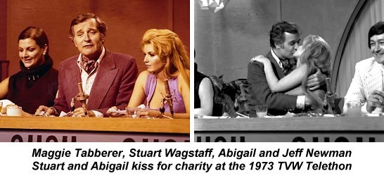
The TEN-10 produced ‘Number 96′ was a popular Australian soap opera set in a Sydney apartment block, with 96 as its street address. The show ran from 1972 until 1977, and became famous for its ground breaking sex scenes and nudity on Australian TV. Abigail quickly emerged as the show’s most famous sex symbol. Abigail met her husband Mark Ashfield at TVW whilst he was floor managing and she was doing promotional on-camera appearances. Both were involved in the local theatrical scene, with Abigail appearing in ‘There’s a Girl in my Soup’, after arriving here from the UK.
The veteran television engineer and vintage equipment collector Ian Stimson, points out that the Circle 7 logo was really the brainchild of Hymie Millar at TVW. This was the rotating one used in the lower Right Hand corner of the screen during the black and white era. It was mounted in a caption scanner and then keyed into the program video. The rotating Seven was the size of a TWO Shilling coin and was in fact just that!! it was driven by a 2 rpm timer motor. Ian at the time was comparing notes with Hymie and built a similar unit for Southwestern Telecasters using the ‘timer motor’ from an old Bendix washing machine.
This led to a flurry of activity as we investigated the use of TVW logos over the decades, resulting in much correspondence back and forth, with veteran producer/director Brian Williams explaining the origin of the early ‘Eye’ logo. Brian advised how Geoff Wallace and he produced the first animated ‘Eye’ logo on an old Paillard-Bolex in Geoff’s backshed. It was their first attempt at simple film animation and occurred in 1966 (Bolex is a Swiss company that manufactures motion picture cameras and lenses, which started out as a subsidiary of the Paillard gramophone motor company).
HSV-7 Eye Logo in 1967 – Promos and News clip
Conniptions886
A quick clip of a 1967 HSV news broadcast, featuring Geoff Raymond and David Johnston.
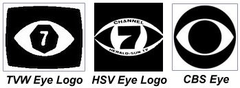
Andrew pointed out that HSV-7 in Melbourne had an eye-shaped logo in the 1960s before switching to the Circle ‘7’ logo in 1970. We wondered if the American CBS television network eye was an influencing factor, as they unveiled their ‘Eye logo’ in 1951.
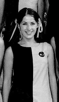
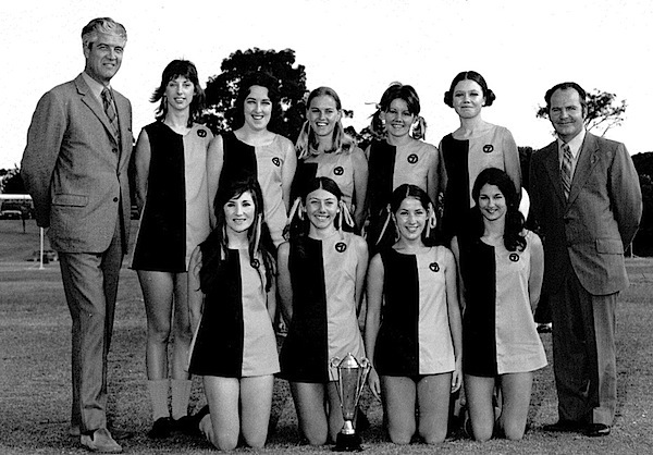
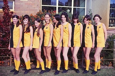
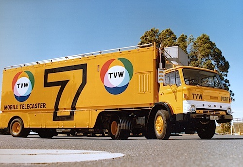
Here is further evidence of the Circle 7 Logo being used before the advent of colour TV. It was used on the TVW Channel 7 netball team costumes during the early 1970’s, before the Colour TV launch in 1975.
Richard Ashton and his grand-daughter Emma then followed up with a visit to the WA State Library, where they checked the TVW annual reports for an indication of official logos. They noted that until 1967, the annual reports were plain text, from 1967 the first logo (the Seven eye) appeared and continued right through to 1975. The glossy colour Annual Report presentations mark the period when Richard became involved in their preparation, by contributing an increased promotional flavour.
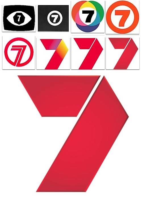
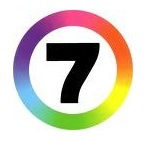
The multi coloured circles appeared in the 1971 report, yet the ‘Eye’ was still dominant, though the 7 had become much thicker. There was no ‘Eye’ in 1976, only the coloured circles version. The number 7 with a rainbow circle was used in 1977. But in 1978 and 1980 there was no logo, though in 1981 and 1982 the plain number 7 with a circle around it was used. From this point on the company was controlled by Robert Holmes à Court, so no further annual reports are available at the library, as TVW disappeared from public ownership.
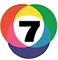
Richard Ashton explained the origins of the TVW logo featuring the Additive (Red,Green, Blue) and Subtractive (Yellow, Cyan, Magenta) colour mixtures. The additive process is used in colour television whilst the subtractive process is used in colour film. In the television system, Red, Green and Blue combine to create white, whilst in colour film the three primary colours, Yellow, Cyan and Magenta are located in three separate dye coloured layers on the film emulsion, where the presence of all three act to filter all light to produce black.
TVW Logo for 1975 Colour launch in WA
This logo was adopted by TVW for the introduction of colour TV in March 1975.
Sir Charles Court officially launches colour TV on TVW
Colour television was introduced across the Seven network in 1975, along with a new logo incorporating a bright ring of the colours of the visual light spectrum. Though at that point TVW was still an autonomous station making its own decisions.
The following is the Seven Logo for the 1975 Colour launch in the Eastern States.
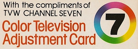
TVW eventually adopted this logo as it is shown below on a card explaining the TVW colour test pattern.
This logo was used nationally until 1989, when a new red logo was introduced along with the evening soap Home and Away and a relaunched Seven Nightly News (later to become Seven News).
Though nine years earlier, to commemorate TVW’s 21st birthday in 1980, Seven draped the outside wall of Studio 1 with the below banner.
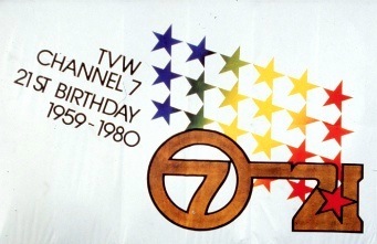
TVW Banner dated 1980
Seven Perth Promotions Manager Jill Glass reports that when she started with TVW…
“The red circle was around in 1982 and the angular circle came out in the late 90’s (I had the job of going around to everyone’s office and collecting the old letterheads and dishing out the new!)”
“The last two logos were both released in 2000; however, after a few years, the coloured ribbon was phased out and only the plain red logo was used. We now have a “3D” version as well.”
(Note that the 3D logo hasn’t replaced the flat red “7” logo but is an additional logo that can be used.)
“The coloured logo was mainly for on-air applications and the plain red was used more in print. Our Managing Director at the time (Chris Wharton) was the only one who had letterhead with the coloured logo: the rest of the station used the plain red Seven.”
“The attached promo which was made in 1979 has the Seven Logo in blue, but you’ll notice the coloured logo on Gary Carvolth’s jacket.
1979 TVW Promo with ‘Ma Num Ma Num’ theme
TVW Seven Perth Promo with the ‘Ma Num Ma Num’ theme of the 1979 era, within the scope of 50 years of broadcasting. Featuring Alison Fan, Peter Waltham, Diana Christensen, Stephanie Quinlan, Carolyn Noble, Gary Carvolth, the World of Football ‘Dad’s Army’ team and Fat Cat.
The following is the TV Week article from 1973 showing the Number 96 star Abigail, on a visit to Perth, wearing the T-shirt with the Circle 7 logo.


My favourite logo used by TVW was the primary colour circles logo that was contemporary to the introduction of colour TV: very clever how not only does it demonstrates colour theory, but also has seven segments. Yet it was not used on air too often, as far as I can tell (I may add, my memory is very limited, for I was born in that colour transition period in late 1974 to early 1975 before the official introduction on 1 March 1975, my parents acquiring an HMV colour set at the end of that year).
When colour had commenced, as seen in the 50th anniversary special, there was a promo which had six ladies dancing about with the letters “COLOUR” with the overlapping circle logo hung high in the background, then the ident spot ended with the animated “colors your world”, with the rainbow ring seven logo. So therefore those two logos were in simultaneous use, so it seems. This likely occurred as this allowed the various Seven affiliates across the states to pool resources (apparently the animation was done in the USA, thus probably quite a costly exercise) and as for TVW, the overlapping circles logo—stylish as it was—was also very difficult to render into a monochromatic format for print and captioning purposes, so doubtless there were practical considerations behind using the single circle one. Thus the primary colours logo was mostly used for corporate purposes, such as stationery and equipment, although I’m sure that I remember that this logo was used on the slide announcing the nightly closedown with an image of the nighttime city skyline…can anyone confirm this?
Finally, well done to all who have contributed to this article: excellent research there!
I lived in Perth 1981-1983, and I would very much like a copy of a channel 7 Ident film, featuring different views of the city, and the words included ‘Perth is a nice place to be’. It was usually played first thing in the morning.
Can you help me – or does anyone even remember this short film?
Love to hear from anyone who may be able to help me
Many thanks
I’m looking for TVW7’s 21st Anniversary promo/campaign from 1980, in which the lyrics goes like
“Going Side by Side Together, Entertaining and Having Fun, Now We’re 21, Seven”
Try to see if you can find it, Thanks!
Hey! I’m looking for TVW7’s 1 and only 25th Birthday promo or campaign, where the lyrics goes like “Sit Back, We’re Getting Together, Now We’re 25, We’re TVW7″
Here is TVW7’s 21st anniversary promo: https://www.youtube.com/watch?v=-VLYKsUQ3pE